ML | Principal Component Analysis(PCA)
Principal Component Analysis (PCA) is a statistical procedure that uses an orthogonal transformation which converts a set of correlated variables to a set of uncorrelated variables. PCA is a most widely used tool in exploratory data analysis and in machine learning for predictive models. Moreover, PCA is an unsupervised statistical technique used to examine the interrelations among a set of variables. It is also known as a general factor analysis where regression determines a line of best fit.
Module Needed:
import pandas as pd import numpy as np import matplotlib.pyplot as plt import seaborn as sns %matplotlib inline |
Code #1:
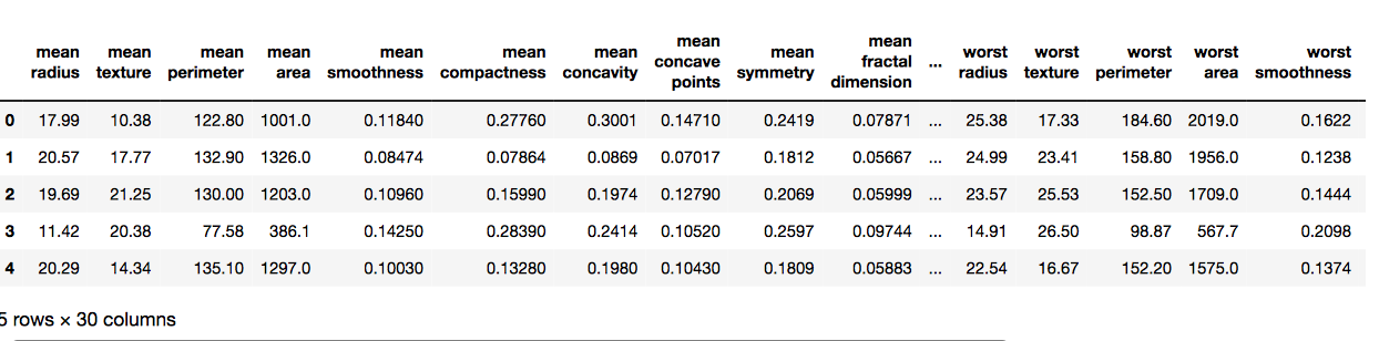
# Here we are using inbuilt dataset of scikit learn from sklearn.datasets import load_breast_cancer # instantiating cancer = load_breast_cancer() # creating dataframe df = pd.DataFrame(cancer['data'], columns = cancer['feature_names']) # checking head of dataframe df.head() |
Output:
Code #2:
# Importing standardscalar module from sklearn.preprocessing import StandardScaler scalar = StandardScaler() # fitting scalar.fit(df) scaled_data = scalar.transform(df) # Importing PCA from sklearn.decomposition import PCA # Let's say, components = 2 pca = PCA(n_components = 2) pca.fit(scaled_data) x_pca = pca.transform(scaled_data) x_pca.shape |
Output:
# Reduced to 569, 2

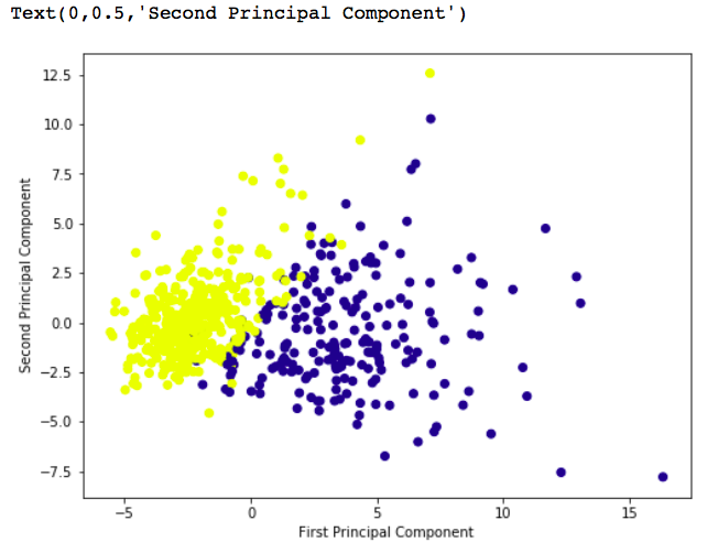
# giving a larger plot plt.figure(figsize =(8, 6)) plt.scatter(x_pca[:, 0], x_pca[:, 1], c = cancer['target'], cmap ='plasma') # labeling x and y axes plt.xlabel('First Principal Component') plt.ylabel('Second Principal Component') |
Output:
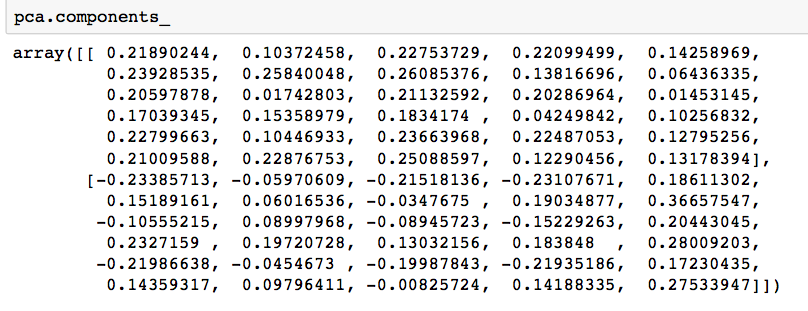
# components pca.components_ |
Output:
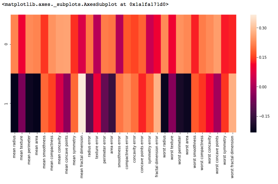
df_comp = pd.DataFrame(pca.components_, columns = cancer['feature_names']) plt.figure(figsize =(14, 6)) # plotting heatmap sns.heatmap(df_comp) |
Output:
Principal Component Analysis with Python
Principal Component Analyis is basically a statistical procedure to convert a set of observation of possibly correlated variables into a set of values of linearly uncorrelated variables.
Each of the principal components is chosen in such a way so that it would describe most of the still available variance and all these principal components are orthogonal to each other. In all principal components first principal component has maximum variance.
Uses of PCA:
- It is used to find inter-relation between variables in the data.
- It is used to interpret and visualize data.
- As number of variables are decreasing it makes further analysis simpler.
- It’s often used to visualize genetic distance and relatedness between populations.
These are basically performed on square symmetric matrix. It can be a pure sums of squares and cross products matrix or Covariance matrix or Correlation matrix. A correlation matrix is used if the individual variance differs much.
Objectives of PCA:
- It is basically a non-dependent procedure in which it reduces attribute space from a large number of variables to a smaller number of factors.
- PCA is basically a dimension reduction process but there is no guarantee that the dimension is interpretable.
- Main task in this PCA is to select a subset of variables from a larger set, based on which original variables have the highest correlation with the principal amount.
Principal Axis Method: PCA basically search a linear combination of variables so that we can extract maximum variance from the variables. Once this process completes it removes it and search for another linear combination which gives an explanation about the maximum proportion of remaining variance which basically leads to orthogonal factors. In this method, we analyze total variance.
Eigenvector: It is a non-zero vector that stays parallel after matrix multiplication. Let’s suppose x is eigen vector of dimension r of matrix M with dimension r*r if Mx and x are parallel. Then we need to solve Mx=Ax where both x and A are unknown to get eigen vector and eigen values.
Under Eigen-Vectors we can say that Principal components show both common and unique variance of the variable. Basically, it is variance focused approach seeking to reproduce total variance and correlation with all components. The principal components are basically the linear combinations of the original variables weighted by their contribution to explain the variance in a particular orthogonal dimension.
Eigen Values: It is basically known as characteristic roots. It basically measures the variance in all variables which is accounted for by that factor. The ratio of eigenvalues is the ratio of explanatory importance of the factors with respect to the variables. If the factor is low then it is contributing less in explanation of variables. In simple words, it measures the amount of variance in the total given database accounted by the factor. We can calculate the factor’s eigen value as the sum of its squared factor loading for all the variables.
Now, Let’s understand Principal Component Analysis with Python.
To get the dataset used in the implementation, click here.
Step 1: Importing the libraries
# importing required libraries import numpy as np import matplotlib.pyplot as plt import pandas as pd |
Step 2: Importing the data set
Import the dataset and distributing the dataset into X and y components for data analysis.
# importing or loading the dataset dataset = pd.read_csv('wines.csv') # distributing the dataset into two components X and Y X = dataset.iloc[:, 0:13].values y = dataset.iloc[:, 13].values |
Step 3: Splitting the dataset into the Training set and Test set
# Splitting the X and Y into the # Training set and Testing set from sklearn.model_selection import train_test_split X_train, X_test, y_train, y_test = train_test_split(X, y, test_size = 0.2, random_state = 0) |
Step 4: Feature Scaling
Doing the pre-processing part on training and testing set such as fitting the Standard scale.
# performing preprocessing part from sklearn.preprocessing import StandardScaler sc = StandardScaler() X_train = sc.fit_transform(X_train) X_test = sc.transform(X_test) |
Step 5: Applying PCA function
Applying the PCA function into training and testing set for analysis.
# Applying PCA function on training # and testing set of X component from sklearn.decomposition import PCA pca = PCA(n_components = 2) X_train = pca.fit_transform(X_train) X_test = pca.transform(X_test) explained_variance = pca.explained_variance_ratio_ |
Step 6: Fitting Logistic Regression To the training set
# Fitting Logistic Regression To the training set from sklearn.linear_model import LogisticRegression classifier = LogisticRegression(random_state = 0) classifier.fit(X_train, y_train) |

Step 7: Predicting the test set result
# Predicting the test set result using # predict function under LogisticRegression y_pred = classifier.predict(X_test) |
Step 8: Making the confusion matrix
# making confusion matrix between # test set of Y and predicted value. from sklearn.metrics import confusion_matrix cm = confusion_matrix(y_test, y_pred) |
Step 9: Predicting the training set result
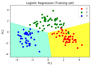
# Predicting the training set # result through scatter plot from matplotlib.colors import ListedColormap X_set, y_set = X_train, y_train X1, X2 = np.meshgrid(np.arange(start = X_set[:, 0].min() - 1, stop = X_set[:, 0].max() + 1, step = 0.01), np.arange(start = X_set[:, 1].min() - 1, stop = X_set[:, 1].max() + 1, step = 0.01)) plt.contourf(X1, X2, classifier.predict(np.array([X1.ravel(), X2.ravel()]).T).reshape(X1.shape), alpha = 0.75, cmap = ListedColormap(('yellow', 'white', 'aquamarine'))) plt.xlim(X1.min(), X1.max()) plt.ylim(X2.min(), X2.max()) for i, j in enumerate(np.unique(y_set)): plt.scatter(X_set[y_set == j, 0], X_set[y_set == j, 1], c = ListedColormap(('red', 'green', 'blue'))(i), label = j) plt.title('Logistic Regression (Training set)') plt.xlabel('PC1') # for Xlabel plt.ylabel('PC2') # for Ylabel plt.legend() # to show legend # show scatter plot plt.show() |
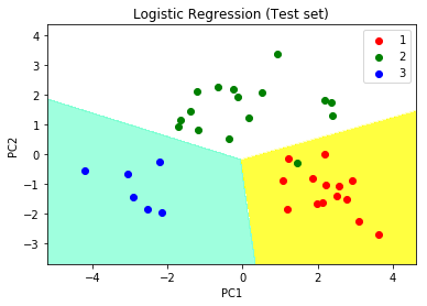
Step 10: Visualising the Test set results
# Visualising the Test set results through scatter plot from matplotlib.colors import ListedColormap X_set, y_set = X_test, y_test X1, X2 = np.meshgrid(np.arange(start = X_set[:, 0].min() - 1, stop = X_set[:, 0].max() + 1, step = 0.01), np.arange(start = X_set[:, 1].min() - 1, stop = X_set[:, 1].max() + 1, step = 0.01)) plt.contourf(X1, X2, classifier.predict(np.array([X1.ravel(), X2.ravel()]).T).reshape(X1.shape), alpha = 0.75, cmap = ListedColormap(('yellow', 'white', 'aquamarine'))) plt.xlim(X1.min(), X1.max()) plt.ylim(X2.min(), X2.max()) for i, j in enumerate(np.unique(y_set)): plt.scatter(X_set[y_set == j, 0], X_set[y_set == j, 1], c = ListedColormap(('red', 'green', 'blue'))(i), label = j) # title for scatter plot plt.title('Logistic Regression (Test set)') plt.xlabel('PC1') # for Xlabel plt.ylabel('PC2') # for Ylabel plt.legend() # show scatter plot plt.show() |